

Article
A designer's thoughts on using AI prototyping tools

At Ackama, we make a point of staying close to new tools and methods as they emerge. Not necessarily because every new thing is worth using for every project, but because the only way to give clients a genuinely useful opinion is to have actually done the work and seen where something holds up and where it doesn’t. There’s a lot of hype around AI right now, and it can be difficult to determine what opportunities for using the tech would drive real benefits and be the best tool for the job, and which have been overpromised. One of the things we can offer our clients is an honest assessment grounded in having actually used the tools.
This post covers a recent experience I had testing out an AI prototyping tool on a complex client project and offers a look at where benefits lay and where it created more work than it saved.
Background and context
I recently experimented with Figma’s AI prototyping tool, Make, to create a functional prototype on a client project. The client wanted a prototype they could use for stakeholder testing before building out a functional product. We originally planned on creating a standard static clickable prototype in Figma, which is our usual UX prototyping process.
Until recently, all you could really achieve with Figma’s built-in prototyping tools was flat pages linked together with clickable areas, plus some very limited show/hide interactions you had to wire up manually. This is usually enough for small features or simple content websites, but can become tiresome and time-consuming to use to create more complex interactions. We were upfront with the client that we’d be constrained by what Figma could do.
The project centred on a creating a usable interface for a large, structurally complex dataset that wasn’t yet publicly accessible. The client was concerned that stakeholders would need to see something that met their needs, and was impressive enough to get buy-in before being able to develop it further into a published, functional product in a future phase of work.
Later, during scope discussions, we were also asked to consider how the new interface might accommodate a second dataset with a quite different structure, as bringing that into scope would help them make the case for budget for the final build. While possible in theory, it was initially difficult to envision how both datasets could utilise the same interface.
Early discovery and Figma Make experiments
I spent the first part of the project in the normal discovery process: running workshops with the client, understanding the data itself, working out who the users were, what the client’s goals were, what data should be displayed, and mapping out what each field actually meant across both datasets to try to see what alignment there could be.
Merging two datasets with quite different, complex structures into one interface was a challenge I wasn’t sure was even solvable, so I started playing around with Figma Make to see if it was possible in principle. Describing the two datasets, providing example dummy data to display and some initial sketches of layouts in a prompt generated some rough starting points that then spurred some more ideas about how the interface could work across both sets of data.
That’s when I realised the tool had come a long way since I’d last used it, and that we might be able to produce something far more functional than originally estimated.
Before showing the client these initial experiments, I wanted to be sure the output would be controllable and changeable before promising anything, which in hindsight was the right call. After doing some stress-testing, I was able to feel fairly confident that the prototype output could continue to be tweaked in the ways that we needed, so suggested to the client that we try out using this tool for the prototype.
The process of using Figma Make
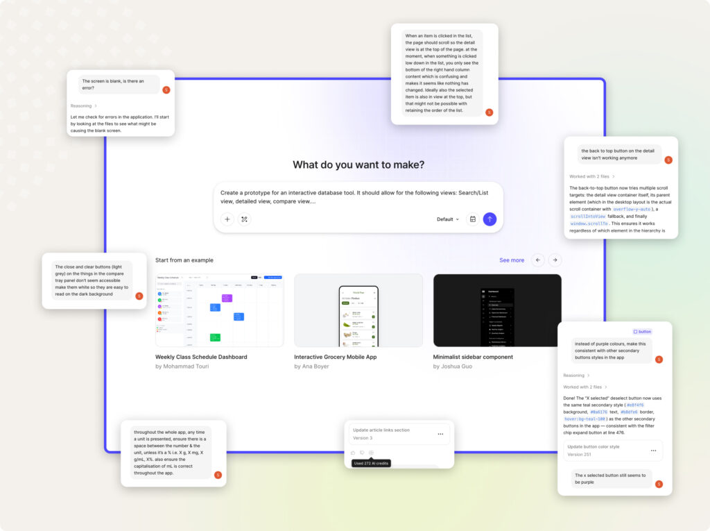
Overall, the process of prototyping in Figma make was fairly straightforward. It allows you to use text prompts, provide attachments (including Figma design libraries and individual Figma designs) to help build up your prototype. However, it’s not a magic machine that will immediately spit out something high quality straight away. It required a lot of iteration and rework.
My process ended up being a back-and-forth loop:
- Create wireframe layouts in Figma Design tools
- Paste those into Figma Make and prompt it with detailed functionality instructions including datasets to build the prototype
- Review the prototype with the understanding of user flows and needs from previous discovery sessions and accessibility/usability considerations
- Iterate on the prototype with further prompts
- Copy the designs generated by Figma Make back into Figma Design to clean up the UI to align with the clients brand/my vision, make more specific changes, then paste back into Figma Make again
- Occasionally import new versions of the datasets based on client feedback, or to correct errors in the initial dummy data
It wasn’t the ideal process. In Figma Make, the prototype is always decoupled from the design “source of truth”. Every time I wanted to properly document designs or fix layout issues from the prototype copy, I’d essentially have to start again. Also, despite the promises of being able to connect design systems to the tool, it turned out to treat them more of as a suggestion about colours and styles than a hard constraint it wouldn’t deviate from. The output often didn’t match the designs that I fed into it without manual editing of the source code or direct prompting.
For me, this is the real dealbreaker for using an AI tool as your primary design source on anything beyond a quick prototype. The iteration is manageable, but the lack of an enforced connection to a design system is not. A good interface doesn’t come from individual screens looking nice in isolation, it comes from consistency, like buttons looking the same throughout so they’re easily identifiable. That consistency is what makes an interface usable and accessible, and what keeps it maintainable as it grows. When a tool treats your design system as a loose suggestion and fills the gaps by embellishing with its own details, that consistency starts to erode. For a throwaway prototype to test features and concepts, that might not matter, but for a product someone has to build and maintain for years, it matters a lot.
Credits and costs
Figma Make can be very credit-hungry, and there’s no easy way to track how many credits a project has consumed. It was free to use as part of it’s introductory trial period for the majority of this project, but now at the time of writing, a design seat includes a set number of credits a month, and an additional 1,000 credits costs around $24 USD a month. Also, currently there’s no way to see how many credits went into a specific prototype file, which could cause real problems for accurately costing projects.
Through working on this project, I developed a few techniques to help reduce unnecessary credit use:
- Code mode edits: You can switch to code view and make changes directly if you know what you’re doing with the code and CSS. I also copied more complex snippets of code into other AI tools to help work out the changes I needed, then pasted the result back.
- Inline styling changes: Small tweaks to colours, font sizes and the like can be made via Figma Make’s own tools without consuming credits.
- Model selection: Different models use different amounts of credits. I found Claude Opus gave the best results, though it’s also the most expensive to run.
- CSV imports via code view: Once I had a clean CSV import structure for the sample data, I could go into code view and replace sample data by copy-pasting from a text file, saving a lot of time and credits versus re-importing via prompts.
Working with large datasets
Getting the dummy data into the prototype was its own challenge. The sample data came as CSVs split across multiple files, often with far more records than I needed. Using AI tools to help extract a clean sample had mixed results. They got confused and merged columns (or invented new ones), made up data for fields, and long number strings caused rounding errors. One of the datasets had over 160 fields, with visibility of those fields depending on the record type, so it was difficult to check the data for accuracy.
Data accuracy mattered a great deal on this project, which made this especially painful. If I’d had stronger Excel skills, or paired with a developer to write a script instead, I’d probably have had better results. It was a good lesson, though, in not immediately trusting the output from these tools without reviewing it yourself.
Other quirks and issues with Figma Make
- Ghost features: The AI would sometimes add its own ideas for features I hadn’t asked for. These hung around in the codebase and resurfaced later in unexpected places. For example, I replaced dummy taxonomy data the AI had generated with the correct data, but the old taxonomy kept reappearing in different locations.
- Sharing and feedback: You can only publish and share one version of the file, and there’s no commenting functionality like in regular Figma prototypes, so the feedback process had to be managed outside the tool with screenshots and the like. I also had to duplicate the prototype to preserve specific review versions, otherwise the client would keep seeing in-progress updates. The ability to rollback to previous versions was useful (and occasionally necessary, as the tool would sometimes break its own prototype with a change).
- Unexpected prompt issues and costs: When a prompt triggered a big change, the tool would split it across multiple responses and pause to ask you to press continue. There were also occasional unexplained bugs where prompts ran for ages and then failed without explanation, or completed but broke the prototype and required more credits to fix.
- Features that worked previously, suddenly not working: More than once, after working on one area of the prototype, I’d discover another feature I had completed and verified was missing or broken. I had to constantly recheck the whole prototype repeatedly.
- Noticeably “AI trend” UI design: The UI Figma Make initially generates has a very recognisable look to it (that particular era of crypto/NFT purple you’d see all over Dribbble a few years back). It can only produce what it was trained on, and it shows. The result is less novel visual design, and there’s a real risk of accidentally reproducing something that closely resembles existing UI from other products without realising it. For a client who needed something that felt considered and appropriate for their context, and that matched their existing style guides, it took a lot of corrective prompting and manual overrides.
Was it time (and credits) well spent?
For this project specifically, I think it was worthwhile, for a few reasons:
- The interface was complex: Two datasets with very different structures, deep data hierarchies, and a lot of conditional display logic. A standard flat Figma prototype with linked screens either wouldn’t have been able to demonstrate how this interface needed to work in any convincing way, or it would have been incredibly time-consuming to manually link up every state.
- There was a need for a functional prototype: The client needed something that could hold up under scrutiny from people deciding whether to fund the next phase. A more realistic, interactive prototype was worth the extra effort given what was riding on it, and the priority was testing usability and desirability with stakeholders over purely visual design.
- It was a novel kind of interface: There’s no established pattern to point to for how this kind of interface should work, how the data should be progressively disclosed, or how comparison across two very different datasets should behave. Working through it in something functional helped surface interaction problems, and brainstorm solutions, in a way a standard prototype wouldn’t have.
- We could extract the source code: Early on we tested whether we could get workable code out of Make, and we could. It was extracted and stood up locally by our developers, which means we can keep working on it later outside of Figma.
That said, I wouldn’t necessarily consider making this part of a standard workflow for more basic functionality like CMS-driven sites, or to fully create a large complex product. The back-and-forth between tools, the credit costs, the decoupled source of truth, and the loss of proper component documentation all add up. For a more typical project where the interaction patterns are well understood, I’m not sure the overhead is worth it. It worked here because the project specifically called for it.
Closing thoughts on AI-assisted prototyping and the design process
The strangest part of this whole process was how it inverts the design workflow I’ve become used to. Normally you move from rough sketches to wireframes to higher-fidelity mockups, letting the concepts evolve gradually until you reach a polished solution.
With AI prototyping tools, you can get something visually polished very fast, but then the real work is iterating that solution to get the basic parts right, and it felt backwards at times. By the end, the prototype had been through hundreds of rounds of prompting and changes to get it into a state that aligned with user needs, client goals, and design and accessibility best practice.
There’s solid rationale in UX practice for starting with rougher ideas. Low-fidelity work keeps conversations focused on structure and hierarchy rather than getting lost in the details of fonts and colours, and lets you question ideas before anyone gets attached to how something looks. When you show people highly polished UI, people stop asking “does this work? does this solve the problem?” and get caught up in minor visual details like colours.
That’s exactly what happened the first time we showed the prototype. The first piece of feedback was about the colour of an element, not the usability of the features. Both the client and I got pulled into the weeds too early, debating details that probably didn’t need solving yet. Starting rough would have kept those conversations at the right level of abstraction for longer.
More broadly, I’ve been thinking about where AI fits in a UX and UI design workflow. Discovery work, workshops, questioning assumptions, sketching, iterating and testing rough ideas, is where a lot of the hard thinking happens. When you use AI to skip straight to polished prototypes, you’re handing off a lot of small design decisions before you’ve had a chance to work through them yourself. You can end up with something that looks resolved but that you (and the client) don’t fully understand.
There’s a real risk that junior designers, or teams under budget pressure, skip the early work entirely because the tools make it feel unnecessary. Working at low fidelity forces you to make decisions about structure and flow before you get caught up in how something looks. Skip that stage and you fall into the common trap of mistaking “this looks good enough” for “this works well”.
A lot of the value in design work is in the doing, not just the output. Working through a problem slowly, and making decisions at each stage, is how you build understanding of what you’re making and why. AI tools can absolutely be useful, but it’s worth thinking carefully about which parts of the process you hand off.
So, should you use AI prototyping for your project?
That depends. The trade-off between rough and polished prototypes is something that has been long-considered in UX spheres, and the consensus has been fairly settled for a long time: when a prototype looks finished, feedback shifts to visual details like button sizes and colours, instead of the structural questions that actually determine whether a product will succeed. The usual advice is to match your fidelity to your uncertainty: the more you’re still testing assumptions, the simpler your prototype should be. AI prototyping tools don’t change that principle. They just make it much easier to skip past the rough stage without even realising it.
Here are the questions I’d actually ask before reaching for one of these tools on a project:
- Do you already understand your users, their needs, and the problem well? If you’re still working that out, jumping straight to a polished prototype tends to produce something that looks resolved but bakes in decisions you haven’t properly thought through yet. The rough stage is where that thinking is meant to happen.
- Are you testing a novel, complex interaction, or a fairly standard one? This is where there may be an opportunity to use it as an exploration tool. I have found it useful to test ideas and do research on UI patterns similar to how I would have trawled the internet looking for exemplar websites to draw inspiration from in the past. If there’s no established pattern to point to and you need people to actually use the thing to react to it, a functional prototype can be worth the overhead. For a more conventional content site or a common interface, the same overhead is harder to justify.
- Will this need to be maintained for years, or is it disposable? A prototype that exists to answer a question and then gets thrown away is a great use case. Something that’s going to be built on and lived with is where the lack of an enforced design system starts to really cost you.
- Do you have the time and budget for the iteration it actually takes? The polished first result is misleading. The real work is the hundreds of rounds afterwards to make it correct, consistent and accessible and you will need to budget for that.
Deciding whether to use AI prototyping tools deserves the same scrutiny as any other tool choice: is it the right tool for this particular job? Often the more useful question comes earlier than that – working out what the right thing to build is in the first place.
As a team of experienced designers, we’re well placed to choose the right tool for the job, backed by a solid understanding of UX and UI best practice and a discovery process refined over many client projects. Figma Make can produce something that looks finished on the surface, but it’s missing the thinking underneath that comes from understanding a client’s problem properly and knowing how good products actually get built.
We came out of this project with a clearer sense of where Figma Make is actually useful, the kinds of problems it suits and the kinds it doesn’t. Our experience means we know when these tools are worth using and how to get good results out of them.